CLIENT: Gordon Smith Guitars
PROJECT: Brand Identity
DETAILS: Development of logo, strapline, brand identity
Taking a well loved brand and bringing it up to date is always hard. There are many stake holders and people have grown fond of the old look regardless of how out of date or inappropriate it is.
This was the challenge facing Gordon Smith Guitars – an age old guitar brand with its roots in the punk movement still loved and adored by legions of fans around the world.
However their branding left a lot to be desired, with an old fashioned script font and nothing else in the tool kit it was barely a brand at all. It didn’t work well and certainly didn’t speak to their punk rock, mosh pit, Saturday night audience.
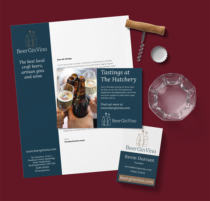
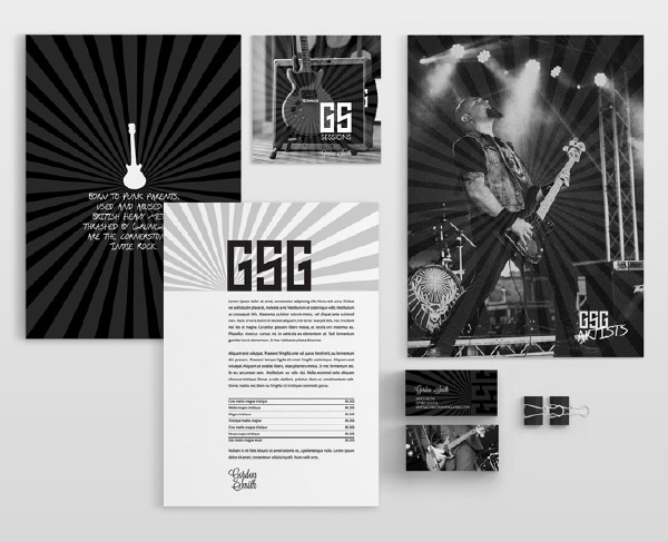
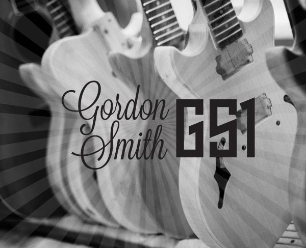
From the clients point of view, a total revolution was out of the question so we tweaked around the edges, updated the script font and dropped that to a ‘signature’ motif rather than the main logo.
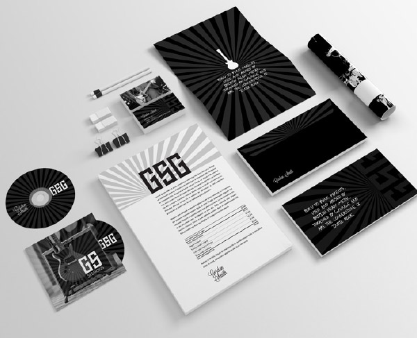
Many people refer to the company as GSG so we used that as the main thrust of the brand in an eye-catching angular font which is softened by the sunburst graphic that is laid over blocks of black and images alike.
The strapline “Born to Punk parents, used and abused by British Heavy Metal, thrashed by Grunge and are the cornerstone of Indie Rock” became a beacon for the brand and it is used heavily across all items – even on a branded beer bottle we produced!
Awemous Says: “The question of evolution or revolution is a hard one to deal with especially when there are long term customers and stakeholders involved. A smart design can bridge the gap between what was and the future of the business needs without alienating anyone”


