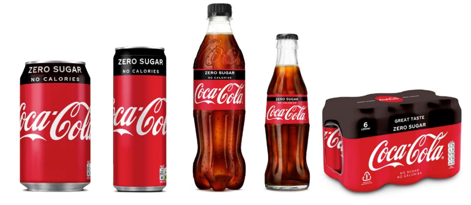
Earlier this year Coke unveiled new packaging for their Coke Zero Sugar brand which heavily incorporates their iconic red colour, a change from the previously all black packaging.
As a giant in the world of business and retail it’s always worth paying attention to what the coca cola company is up to, so here is our take on these recent developments.

He said
As a fan and avid drinker of Coke Zero the new branding has me perplexed. I like / love the black look of the Zero branding so am too not keen on the move to put everything back into the red can.
However I can see a few reasons why Coca Cola might be doing this.
The red can has the most iconic brand in existence. You can show it to someone from Oamaru or Timbuktu and they will know what it is. The black can? Not so much.
And the cynic in me says that Coca-cola is attempting to cover their ass from future lawsuits too. From a macro point of view, the food and drink industries are increasingly responsible for our poor diet and excessive sugar intake. Change all the cans of coke to red and when Cletus in Alabama decides to sue because he got diabetes from drinking 10 cans of coke per day, Coca Cola can rebut them in court by saying ‘are you sure you were drinking the full fat version of Coke sir? All our cans look the same. It’s very likely you were drinking Zero Sugar Coke’.
Ultimately I’m sure it comes down to budget. Marketing budget. Coca-cola is the largest advertiser in the world and promoting the various types of coca-cola (light, diet, zero, vanilla, cherry, etc.) gets expensive if they all need the same level of support. Change them all to the same can and you can get away with making one set of adverts again, just like the good ‘ol days.

She said
Unlike Dave I’m not a fizzy drink drinker and so the full ‘enormity’ of this news has passed me by!
The Coke Zero can was black, then black and red and now it’s red and black, it’s hardly earth shattering stuff. Brand packaging is constantly being tweaked and these designs are all clear evolutions of each other rather than breaking the mould. It’s not like they made the can blue, now that really would be news!!
I hope the transitioning of Coke Zero over to their classic colour is a sign that they are killing off their sugar filled Classic Coke brand and therefore looking for a way to retain their iconic red as part of their range in the future. Which makes sense as there is huuuuuuge brand value in their red colour. It’s instantly recognisable, tied intrinsically to Coke and even changed the colour of Christmas! Losing that would be a unthinkable for them.
The fact that Coca Cola, as one of the world’s most successful companies, is constantly tinkering with and updating designs, products and strategies is a sign that it’s something that we should all be doing in our businesses – even if those changes are small evolutions rather than huge revolutions. Resting on your laurels is a sure fire way to get left behind.
Who do you agree with? Do you have anything to add? Leave a comment or join the discussion on our social media channels!
Do you have a topic you’d like us to discuss on He Said, She Said? Drop us an email with your suggestion and we could feature it in an upcoming issue!