I’m doing an exercise at the moment for a client about what will drive sales of an online software product. Of course, there’s no point designing something in isolation, so a fair amount of research has been going on.
Here’s my pick of the designs from around the web that have stood out as good examples of sales sites:
|
|
|
|
So what makes these stand out and what features do they have in common?
I’ve made a little cover page of notes about this here:
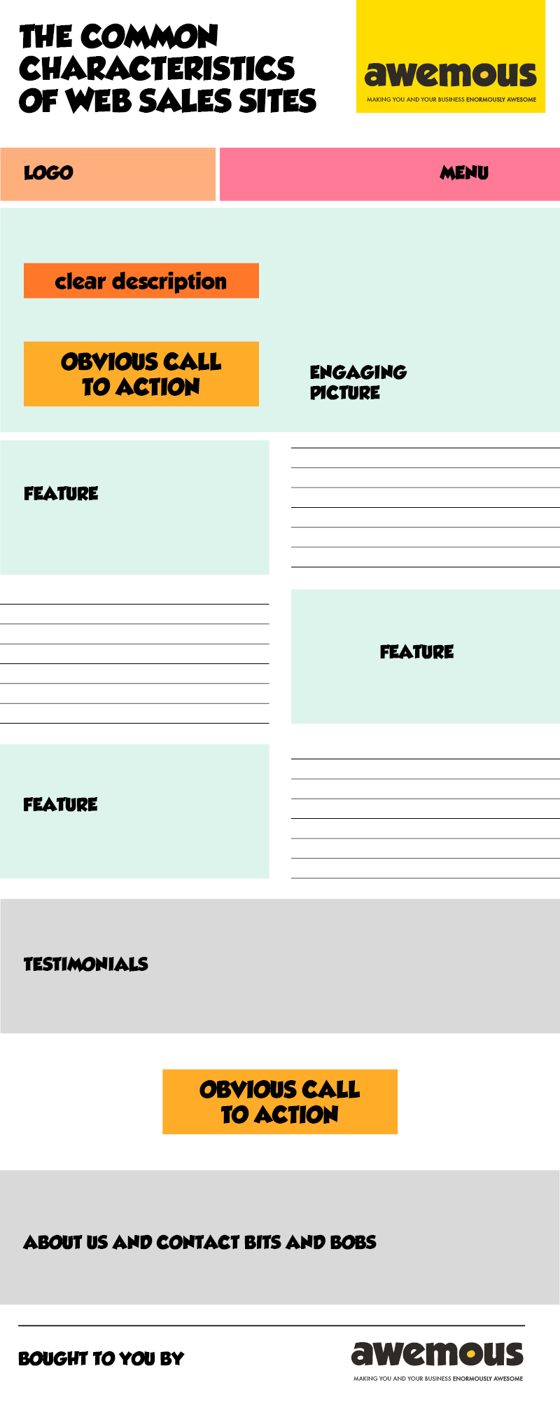
Those common characteristics in detail:
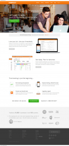
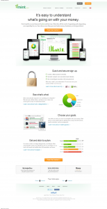
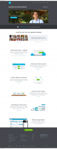
They all have clear signup buttons in the top part of the screen (above the fold) in another colour from the main colours on display.
A very clear description of what they do . Xero – “Beautiful accounting software”, Mint – “It’s easy to understand what’s going on with your money.”, and Harvest – “Spend less time tracking and more time doing.”
A tick / tack description of features down a long scrolling page . Your eye takes in one feature, then is dragged across to the other side of the page for the next feature. You are having to actively progress down the page.
Plenty of white space. This ensures that when there is text, image or call to action that they stand out against the background. There is no straining to figure out what to do next.
Testimonials . Whether they are reviews by magazines or newspapers, or actual users, all these sites have quotes and links to users or reviewers so you can find out from real people what their product does. This helps invoke trust in the product.
Crisp, clean, beautifully illustrated graphics. These are either of close ups of the user interface of the service or specially crafted images to denote things like security (Mint), growth (Xero), or support (Harvest).